

The Beginning of the End of Scrolling Home Pages?
The last few years have seen an explosion of long, scrolling home pages. You know the kind we mean: Nike (their betterworld site). Hubspot. Even the Milwaukee PD.
Not only can they look cool, they often make it more likely that a visitor will see more of your site. A scroll requires far less commitment than a click on a carousel or navigation bar.
That said, scrolling pages and sites are everywhere these days, and Apple’s new Mac Pro teaser site may be a sign of things to come.
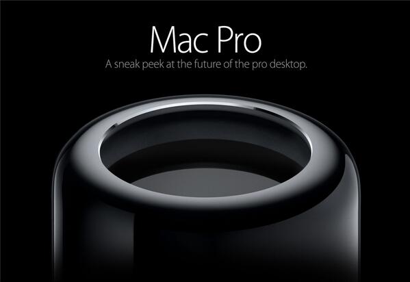
If you haven’t seen the site, you should. It’s pretty elegant design. Technically it is a scrolling website – Apple just forces you to see only one section at a time and uses movies and fades rather than vertical motion to transition from one to the next. But the experience is more like watching a movie than scrolling through a ton of content.
Apple was a little late in moving from skeuomorphism to flat design, as we pointed out in June. Are they ahead of the curve in making web pages short again?
While you’re pondering, feel free to explore one page that elevates scrolling to absurdist art: the World’s Highest Website.
No Comments